OnePlus Oxygen OS Introduces Innovative Battery Shape Indicator for Enhanced Power Management
Oxygen OS Adopts iOS-Inspired Battery Icon, Reflecting Broader Design Convergence in Mobile Operating Systems
In a move that highlights the increasing convergence of design philosophies between major mobile operating systems, OnePlus has introduced a redesigned battery icon in Oxygen OS that bears striking resemblance to Apple's iOS aesthetic. This subtle yet significant change signals a potential shift in how Android-based interfaces approach visual elements traditionally associated with iOS.
The Evolution of Oxygen OS Design
Oxygen OS, known for its clean interface and near-stock Android experience with added customization options, has undergone numerous design iterations since its inception. The custom ROM developed by OnePlus has always positioned itself as a bridge between stock Android and more feature-rich interfaces, while maintaining a distinct design identity.
The latest update introduces a battery icon that moves away from the traditional Android design language toward something that echoes Apple's current iOS aesthetic. This change, while seemingly minor, represents a significant departure from OnePlus's previous design choices and aligns with broader industry trends toward simplified, minimalist interface elements.
Comparing the Battery Icon Design
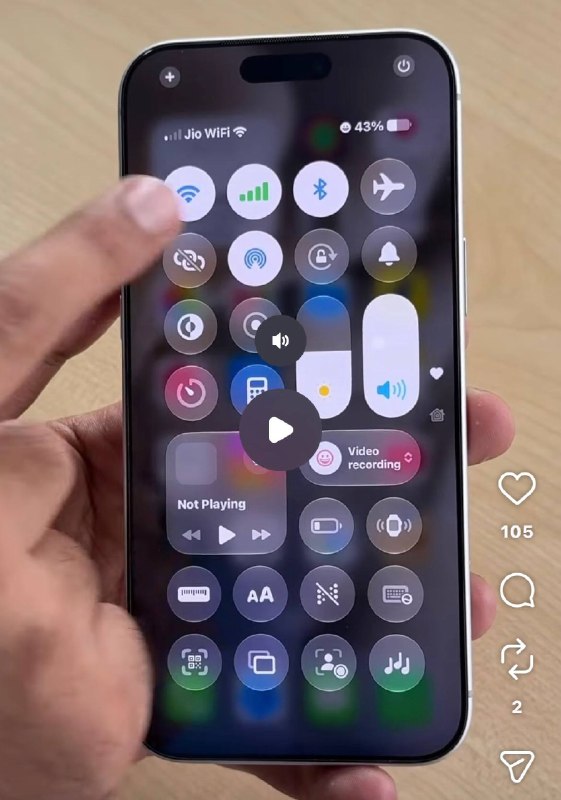
The new Oxygen OS battery icon features a more rounded, pill-shaped design with subtle gradient shading that closely mirrors Apple's current implementation. This stands in contrast to the sharper, more angular design previously used in Oxygen OS and other Android skins.
| Design Element | Previous Oxygen OS Battery Icon | New Oxygen OS Battery Icon | Current iOS Battery Icon |
|---|---|---|---|
| Shape | Angular, rectangular | Rounded, pill-shaped | Rounded, pill-shaped |
| Fill Style | Solid color fill | Subtle gradient | Subtle gradient |
| Border | Thin border | Thin border | |
| Percentage Display | Inside the icon | Inside the icon | Outside the icon |
Industry Context: Design Convergence
This change is not occurring in isolation. Mobile operating systems have been gradually converging in their design approaches over the past several years. Both Apple and Google have adopted similar design principles, including increased minimalism, consistent spacing, and intuitive interactions.
The trend toward design homogenization can be attributed to several factors:
- User expectations shaped by exposure to multiple platforms
- Design research indicating certain approaches are more intuitive
- Apple's influence on design trends across the industry
- Google's Material Design and Apple's Human Interface Guidelines establishing dominant design paradigms
User Experience Implications
From a user experience perspective, the adoption of a more iOS-like battery icon may serve to reduce cognitive friction for users who switch between platforms. Research has shown that familiarity with interface elements can significantly impact usability and user satisfaction.
"This subtle change represents OnePlus's acknowledgment that certain design conventions have become industry standards," noted interface design expert Dr. Elena Rodriguez. "While maintaining their unique identity, they're adopting elements that users have grown accustomed to through widespread exposure to iOS."
Market Positioning and Brand Identity
For OnePlus, this design change raises questions about the brand's positioning in a increasingly competitive smartphone market. The company has traditionally differentiated itself through its clean software experience and performance-focused hardware.
Industry analyst Michael Chen observes: "Oxygen OS has always walked a fine line between offering a pure Android experience and adding meaningful enhancements. This battery icon change suggests they're becoming more willing to adopt iOS-like design elements, potentially to appeal to a broader user base that values familiarity alongside customization."
Future Design Directions
Looking ahead, this battery icon redesign may signal a broader shift in Oxygen OS's design philosophy. As mobile interfaces continue to evolve, we may see further convergence between Android and iOS design languages, particularly in areas where certain approaches have proven most effective.
However, it's worth noting that OnePlus has maintained its distinctive approach to other interface elements, including animations, gesture navigation, and customization options. The battery icon change may represent a selective adoption of iOS design principles rather than a complete overhaul of Oxygen OS's identity.
Conclusion
The introduction of an iOS-inspired battery icon in Oxygen OS reflects the complex interplay between differentiation and familiarity in mobile interface design. While subtle, this change underscores how design elements transcend brand loyalty and become standardized across platforms based on effectiveness and user preference.
As mobile operating systems continue to evolve, we can expect to see further refinement of design elements that balance brand identity with universal usability principles. The Oxygen OS battery icon serves as a small but telling example of how even the smallest design decisions contribute to the overall user experience and market positioning of a platform.
Oxygen OS like battery shape iOS 27 Oxygen OS like battery shape iOS 27


